What's up at Ravens March.

Vintage pens-Handmade books-Silly statements

Archive for April, 2013

Long Live the King!

Posted by Dirck on 30 April, 2013

Today’s Pen: Parker 180 Imperial
Today’s ink: Herbin Orange Indien

Wait… don’t I usually finish with that?  Well, I’m all topsy-turvy today, with slightly misplaced royalist excitement.  Being a first-generation Canadian as I am, at least on my father’s side, the passing along of the sceptre and associated bits in The Netherlands is a bigger deal for me than it really should be.  Thus, a splendid pen with somewhat modern lines, and an ink whose colour honours the royal house– and it’s being used for just about everything today, as the desk pen is being left only for sombre matters of business.

The most foolish reason of several which I have for my current confused giddiness is the need to rethink the gender of the Dutch crown.  Three queens in a row, two of whom have been in charge during my lifetime… it’s rather difficult to shift to thinking of precedence in toasts starting with “King”.

A Dutch queen... but not THE Dutch queen.  It's an important distinction.

A Dutch queen… but not THE Dutch queen. It’s an important distinction.

I know that it’s not really fashionable in this highly democratic age, but I rather like the notion of royalty.  While history offers some extremely dubious objects to be found inserted between crown and throne, the ideal royal family is a very useful item.  One of the great ills of most modern governments is that, however those involved might protest the contrary, their vision is limited to the distance between now and the next election, and their policy is more dictated by keeping the other lot (oh, the immoral scoundrels!) from office than any positive concern.  A monarchy, which is only slightly concerned about elections, can and should take a longer view, thinking not “how will things stand five years hence?” but rather looking at the heirloom value of their nation; will it be in fit shape for continued use when the great grand-children come to take it over?  This can lead to slight blindness regarding innovation and change (as we watchers of Downton Abbey have seen), but the advantages can be enormous in terms of the general well-being of the population.  Ideally.

The event also beings along a contemplation with the notion of abdication.  Those three queens I mentioned above have all stepped down voluntarily in favour of their successors, and enjoyed (or so I hope) years of retirement and relaxation.  Koninkrijk der Nederlanden has endured through these orderly changes essentially intact, despite the two major wars Europe threw in the course of them.  I look to my own queen, Elizabeth Secundus, and I wonder… what’s the problem, Liz?  Charles is a rather more suitable candidate for the crown than was, let’s say by way of example, the reprobate Prince Bertie when his mom finally keeled over.  I suspect people in England and the rest of the Commonwealth would not break out in open rebellion against the established order, and a number of us would respect the institution more than we do now.

But, I guess Windsors will be Windsors (now that they’re not Saxe-Cobergs) and cling tenaciously to their thrones, while the funky Orange-Nassau bunch get up to their free-wheeling antics.  I heard this morning that Willem-Alexander’s installation had substantially reduced the average age of European crowned heads, and that’s bound to be a good thing.

For what little it’s worth, I deeply approve of the new names of ruling couple, since my father may finally be able to stop explaining how to spell his own first name with a famous example in the news (although Willem Dafoe didn’t turn the trick) and it’s going to be very hard for another country to come up with something cooler than Queen Maxima.  A quick review of the other houses shows no Galactus von Doom in the wings.  In any event, long life to Willem-Alexander and Maxima, as long a reign as you think is appropriate, and a merry retirement party to Beatrix.

Posted in General Blather | Tagged: , , , , , , , , , , | 1 Comment »

The Usual Roller Coaster

Posted by Dirck on 29 April, 2013

Frankly, I rather prefer non-metaphorical roller coasters.  Assuming one’s glasses don’t disappear into the ether during the ride and everyone else on the trolley has a sensible approach to sequencing regarding random g-loading and overindulgence in root beer and corn dogs, they’re fun and of low consequence.  Metaphorical roller-coasters, on the other hand, are more apt to leave one exhilarated and remembering the valleys more than the peaks.

So, with the clicking of the lift-chain now done, let me tell you about my weekend.  Down we go into a distraction which in only in remission, and which promises to flare up all summer long; the first drop is always the big one.  A good chunk of Saturday morning was lost to a scouting out of a house which my father converted into an office about twenty years ago.  The past several years, he’s been in a partnership with a fellow with rather more spacious digs, and he’s decided that it’s about time to give up on his base of operations.  There’s some rather nice furniture in there he’s got nowhere for… and which his sons would love to take if there were way more floor space in either of their houses.  This shifting, re-laying, and making of unwelcome decisions will linger through the rest of the warm months.  I brought home a couple of things that were easily carried by me alone, and my wife and I are already on the very edge of the non-fun sort of madness from the crowding it’s caused.  The bigger desirable things may end up forming lessons in the virtue of detachment.

But then we sweep up into working on pens! WHEEE!  I bought a replacement point for my Pelikan M600 for the purposes of experimentation.  Before anyone starts wondering where the money for that came from, I’ll mention that it’s not actually an M600 point, but rather a steel M150 unit.  It looks a little funny, being to the wrong scale, but it works and it cost about 1/5 what the regulation item goes for.  I wanted to have another run at reshaping the tipping with a clear notion of what the end-point should be, as another step along the path to doing to to/for other people.  The B point that I started with is now a pleasant-writing 1mm stub which inverts to write with a smooth F line, and I’m pretty happy both with the speed of the process and the result that my non-powered point-grinding apparatus produced, but given a couple of breath-holding moments during the task, I’m not quite ready to start advertising it as a service.  Say… I wonder if I might set up a Kickstarter to pay for some points I can practice upon?

The next descent is also family related.  My son has entered into a bit of a phase of authority-questioning, and that’s not a lot of fun.  Since some of the questions he harbours are in the area of “Sure, they say taking light-bulbs out of sockets is bad…” it’s not the sort of thing we can really ignore while it runs its course.  My dark inward Darwinist thinks that the matter will get settled a lot more quickly if the mite tastes some of the consequences of his actions, but the voting majority of internal sub-aspects think that it’s very hard to tell just how extensive those consequences might be and permanent disfigurement of himself or another might be a little too far to go for a suitable lesson.  Averting same is starting to get very tiring, though.

Up: Resacking of some Parker converters.  Not a big deal, but it’s nice to have it in hand, and to get a couple of extra slender converters in reserve.

Down: Persistent wickedness of a Waterman Taperite section on a client’s pen.  It’s very nearly at the point of throwing in the towel, as a couple of relatively clever tools have not turned the tide on it.  This stinks both because I hate to not get the pen back on its feet, and because it complicates a billing; it’s just one of several pens of his I’ve been working on, and the others have all responded to treatment.

Up: The final return to service yesterday of today’s pen, and the coincidental(?) appearance of reasonable weather, complete with dazzling sunshine, chirping birds and even a couple of butterflies.  The snow in the backyard is now merely half-shin deep, and waning briskly.

And the last drop of the ride, the one that brings the whole giddy affair to an end… I hardly like to name it.  As I was retiring last night, I found that one of the cats, and I’m pretty sure I know which, decided for reasons only a cat could formulate, that a new place to stink up was needed, and that place was the little chest of drawers which serves me as a bedside table.  It also serves as a place to store some of my own pens (client pens and cats are NOT allowed to mix, of course), and the fouling managed to penetrate inside a drawer.  Fortunately, I found the problem mere moments after its creation, so nothing was ruined, but it’s a hell of a way to finish a weekend and sees a score of boxed pens needing a new place to live, since I can’t trust that drawer any longer.

I could, indeed, do with a couple of days off.

Today’s pen (sweet, shining solace!): Sheaffer Imperial Triumph
Today’s ink: Herbin Poussière de Lune

Posted in General Blather | Tagged: , , , , , , , , , | 2 Comments »

Spitting Image

Posted by Dirck on 26 April, 2013

Less a film today than a bit of playing with the properties of the ol’ eyeballs. I speculate, because I’m too lazy to actually go digging for it, that what happens to the images is an artifact of the blind spot on the retina.

I would also imagine that this is going to lead to all sorts of conspiracy theorists making noise about the shape-shifting aliens that run Hollywood.

Today’s pen: Sheaffer (Sailor) Sentinel
Today’s ink: Skrip black

Posted in General Blather | Tagged: , , , , , | Leave a Comment »

Appropriately Named (if somewhat overblown)

Posted by Dirck on 25 April, 2013

I’m in an uncommon haze of joy.  My little issue mentioned on Monday with the fiction submission, followed by some very kind advice, has culminated in an email including the words, “We are happy that you resubmitted.”

This is, of course, not acceptance of the tiny little stories in question, but a simple indication of willingness to glance at them.  Still, that’s a lot closer to published than anything of a non-website nature I’ve managed since a small article in a gaming magazine a generation ago, and as far as fiction I’ve never had anything in a position to direct some cash my way.  I dance my manic victory dance to celebrate the potential of nearly $24 (or less), not because it’s a vast fortune, but because it shows my inner cynic that I am not a wholly inert spectator beside this path.  I am, however slowly, travelling along it.

My congratulatory gift from the world at large was the safe arrival of one of the very few pens I’ve bid on this year.  Intact, and costing coincidentally close to the payday that may eventuate from the stories, a Sheaffer with a name which suggests rather forcefully a happy conclusion to the review process– Imperial Triumph.  All I need is Vercingetorix chained up behind my chariot, and I’ll look the way I feel.

I’ll add a picture of it here, as it’s a rare confection of a pen, when its guts aren’t all abroad on my work-desk (when drunk on glee, refitting a Touchdown mechanism is possible; I don’t urge it when other sorts of drunk are active).  For the moment, I’ll offer a link to a page which hints at the glory of it.

Updated the next day:

Pretty nice, that.

Pretty nice, that.

Today’s pen: Parker VS (which I take at the moment to stand for “Victory!  Success!”)
Today’s ink: Pelikan Brilliant Brown

Posted in General Blather | Tagged: , , , , , | 5 Comments »

You’re Doing it Wrong… Oh, Wait.

Posted by Dirck on 24 April, 2013

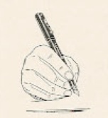
The correct grip, aka the tripod (old-style, index finger atop)

The correct grip, aka the tripod (old-style, index finger atop)

Those who are familiar with the whole of my work (or at least that which is permanently accessible and admitted to) will have seen me comment in one or two places on the correct way of holding a pen.  I make much of this on my site, devoting several paragraphs and words to the effort.  I’m not alone in this notion of the correct grip;  I can point to German pens have such serious finger-directing shapes that in their cases I capitalize the matter as Correct Grip.  It’s not a new development, either, since this sort of sculpting of pens goes back to at least the Parker VP, and as I point out on that page on my site there are pictures dating back many centuries showing this same grip.  When I say, to myself or others, “Hold your pen properly!” I mean either the sort of thing shown to the right here, or the more modern version the Germans urge, with the middle finger beneath while the thumb and index finger are on the upper curve.

Let us turn from these dry academic matters for a moment.  A while ago, I saw an unfamiliar Lon Chaney film coming up on TV– The Ace of Hearts, and it appeared that it Chaney’s character in it was not predicated on his willingness to tie his arms behind his own back or stick wires into his eye sockets, so I was very interested to see what he’d do without the gimmicks.  There was an element of that sort of self-destructiveness to be seen, as it seems he was subjected to both wind and rain machines for a very long time… and I have suspicions that he may have stapled his hat on in the same way as Harrison Ford did for the chase scenes in Raiders of the Lost Ark.  I don’t, I’ll say, particularly recommend it, as it’s a very silly melodrama (although it is interesting to see the notion of a conspiracy to attack the wealthy had currency even a ninety years ago) but I’m glad to have watched it for other reasons.

Technically, still a tripod grip, but that's not quite what we mean.

Technically, still a tripod grip, but that’s not quite what we mean.

Early in the film, the counter-plutocrat brotherhood meets to compare notes on a particularly odious oppressor they mean to slip a bomb under.  Because a good terrorist conspiracy needs to follow Robert’s Rules, Chaney volunteers to keep minutes.  I was dumbfounded by what followed– I had almost never seen someone hold a pen like he was holding it.  It looked comfortable enough, and that “almost” comes about because it was very similar to the grip my son habitually takes when he’s writing, something I was griping about not long before the film was shown.  Amazing!  Even more amazing that I could find a picture of it!

The picture is one I had actually seen before but hadn’t quite registered.  I happened upon it again because someone in a forum had enquired about the meaning of a Waterman point having the word BALLPOINT impressed on the back of it.  I referred to my 1925 catalogue, in which that and a remarkable assortment of other points are available at the time (when’s the last time you heard of a falcon-point in a Waterman, eh?).  The ballpoint was an amendment to make life easier for the left-handed writer, and the page all this appears on has examples of different writing grips which may profit by specialty points.  The Waterman company apparently suggests that Chaney take up an extra-firm point, and offers other suggestions for…

Back-handers,...

back-handers,…

people "afflicted" with left-handedness,...

people “afflicted” with left-handedness,…

and even (shudder) accountants!

and even (shudder) accountants!

So, it appears that my firm stance on grip is… narrow.  Possibly even foolish.  I’ll defend myself by pointing out that the 1920’s were a writhing stew of unconventionality, what with its speakeasies and its flappers, but I’ll also work to be a little less judgemental.  As long as the pen doesn’t mind, I shouldn’t.

Today’s pen: TWSBI Mini
Today’s ink: Pelikan Royal Blue

Posted in General Blather | Tagged: , , , , , , , , , | 6 Comments »

Recounting the Cost

Posted by Dirck on 23 April, 2013

This is a very unsatisfactory entry.  Since the promised (somewhat) more interesting topic occurred to me late, and it calls for me accessing one of my catalogues which I can’t do from here… I’m putting it off.

What I’m going to do to keep my face out of eBay for the next forty minutes or so is to act upon the rather good advice generated by last week’s question, “How to give a modern context for vintage prices?”  That rather good advice was to let the seekers of information who are curious about such things work it out for themselves but replacing my increasingly outdated calculations with links to a calculator.  I’m using this one, because it’s pleasingly imprecise (there are thirteen different answers to any question!) and satisfies my prejudices about economists, and because it also works out pounds, yen and yuan.

I’m already up to Lamy, working my way through alphabetically.  Unfortunately, P – Z is the heavy end of my list.  Off to work, then!

Today’s pen: Waterman Phileas
Today’s ink: Diamine Rustic Brown

Posted in General Blather | Tagged: , , , , | Leave a Comment »

Self-Destruct Mechanism

Posted by Dirck on 22 April, 2013

I spent the weekend in many respects trying to destroy myself.  Physically speaking, I’ve rather messed up my right arm through efforts to get rid of the nascent glacier on our front walk– it’s warm enough for snow to collapse into ice, but not warm enough to do the ice any harm (today’s high– freezing).  It’s not very thick, but there’s enough of it that repeated blows with a spade and the feedback involved leaves me with a bit of a palsy.

There is an item of morale damage that I can only blame myself for which worries me rather more than the brief degradation of dexterity.  I find myself in a bit of a quandary which I’m also going to ask for the thoughts of the passing observer to try and direct my response.  But let me explain.

I’ve mentioned once or twice in the past that I harbour ambitions of being a writer.  We’ll leave the baffled “Why?” behind that aside for the moment, as I’m already upset enough.  Recently, I heard of an open call for some very very very short stories to populate the little nooks and crannies in an upcoming anthology of Lovecraftian fiction.  This is right up my street, thematically, and so I bore down and emitted three items of less than 800 words a piece– 800 being the maximum they’re now accepting.

I applied myself to sending them in on Sunday.  The deadline is 30 April, and since I habitually leave this sort of thing to the utter last moment and thus manage to miss deadlines entirely, I was dedicated to the idea of a timely submission.  The ugly discovery of this process was the strange unwillingness of Open Office running on a Mac to save in Rich Text Format with the layout as desired, unless one really likes single line spacing.  What should have been about ten minutes of cut-and-paste frolics became an hour of mounting frustration (all the more so because mouse work agitated the arm issue), but in the end I triumphed and had all three stories saved in a form both legible and required by the publisher.

…at which point I should have gone off and had a break, as one does when a pen won’t come apart easily.  Ol’ Stupid had allowed himself to adopt an attitude of “Get it to them before some new impediment jumps up!” and so I hurried the email to which the stories were attached.  Utterly insufficient, and vague into the bargain, and I was so addled that having hit SEND I then went into the living room and did a little jig for my wife, having at last submitted anything at all to a publisher.  I accept the fault is my own.  This does not soften the blow of having found this morning a reply from the publisher which I paraphrase as:

Thank you for your submission.  We are sorry to announce that we are only accepting “flash-fiction” of 100-800 words at the present time.

This puts me up in the air.  I didn’t indicate length in the email, having done so in each file.  The implication of the reply is they think I didn’t see the limitation and never looked into the attachments.  Here’s where I need some guidance– do I:

  • Send a reply, saying, “Yes, that’s right, and they’re all of appropriate length,” and accept the risk that however nicely I word it they’ll think I’m calling them inattentive;
  • Assume they’ve deleted the whole affair, resubmit with a better covering email, and accept the risk of being considered an unhappy combination of pushy and needy;
  • Call it a learning experience, leave the publisher in question in peace, and cast about for another venue seeking such things (miniature weird fiction offering such a wealth of outlets, after all)?

I’m not sure I’ve got the necessary focus to pursue a fourth option of building up an anthology of my own in the mode of this chap.  It’s a tempting thought, but it looks to be a lot of concentrated effort, and I think I might be too dilute.  Anyway, there’s my conundrum.  Opine away; I’d especially like to hear what anyone who has direct experience with the publishing industry might have to suggest.

…and having proved that he is an unhappy combination of pushy and needy, he withdrew to formulate a more interesting topic for the next day’s entry.

Today’s pen: Sheaffer Old Timer
Today’s ink: Herbin Bleu Nuit

Posted in General Blather | Tagged: , , , , , , | 5 Comments »

Old Discoveries

Posted by Dirck on 19 April, 2013

I’ve been a little over-earnest over the past week.  Let me address that with a good old-fashioned, slightly non-PC Merrie Melodie as this week’s Friday Fun Film:

Interestingly, the copyright date AND the date on the Youtube title are both right.  I wonder what the delay in release was?

Today’s pen: Waterman Phileas
Today’s ink: Diamine Rustic Brown

Posted in General Blather | Tagged: , , , , , | 3 Comments »

Counting the Cost

Posted by Dirck on 18 April, 2013

I was fixing a spleling arrer on my site this morning, and while I was at it, I had a look at the page for any other mistakes.  There weren’t any… but there was a problem.

On most of the pages, I put down the original price, or at least as close to a sensible guess at the original price as I can make.  Because telling the world that a pen made in 1925 cost $3.00 isn’t extremely illuminating, I generally put down what these guys say that works out to in modern funds– in the current example, that’s nearly $40.  My problem, though, lies in the word “current”.

Inflation hasn’t been as big a problem since the Big Dumb Incident of 2008 as in some times, but it remains an element in our lives.  Currently, that 1925 three bucks is $40, but a year and a half ago when I was working up the site’s current incarnation it was a little over $38.  That means that just about everything on my site speaking of “current value” is a little bit out, and it’s just going to get worse.

…Unless I constantly update every blinkin’ page.  As a fellow with a real house that needs constant maintenance, I’m not in love with the idea of devoting that much effort to repainting something virtual on a regular basis.  This presents me with a choice:

  • Abandon the contextualization of historic pen prices, or;
  • Find a non-variable means of doing so, make one sweeping update, and be content forevermore (on this specific front).

I really don’t like the first option.  It’s all well and good to say “That cost $10!” in tones of wonder, because in 1931 that was a pretty fair pile of cash, but to the modern ear is sounds like “That cost as much as two or three comic books!”  Yawn.  Big deal.

The problem with the second one is figuring out something that is consistently available throughout the past century.  I was thinking bread, but on reflection, saying a Waterman 52 cost 27 loaves of bread, while a Sheaffer Snorkel Crest cost about 100 loaves… well, to me it gets a little hard to visualize that much bread, and it seems apt to lead to a certain amount of snickering.

I know that I usually just spout off here, but now I am posing an honest, non-rhetorical question as to what I might use as my context-token.  What is there that has been in use since 1880 or so, which is still common enough in the  present day that most people will find it familiar, and which is worth in current terms somewhere between $5 and $10?  I’m having trouble settling on something, and a nudge in the right direction would be greatly appreciated.

Today’s pen: TWSBI Mini
Today’s ink: Pelikan Royal Blue

Posted in General Blather | Tagged: , , , , , , | 9 Comments »

Permanent Style

Posted by Dirck on 17 April, 2013

I steal the title of this entry from a rather elegant blog you may want to look at, but I’m using a slightly different inflection.

I don’t imagine it will be a surprise to anyone that I’m in the category of people who rather like Downton Abbey, and one of the things I like about it is the mode of dress shown.  As I was walking just now, I was contemplating how very much I’d like one of the suits worn by the Irish chap who married the younger daughter (I have, I should mention, a certain trouble in the area of retaining names).  This lead me down another path of consideration, and I’m not quite sure how I feel about where it went.

I would, I repeat, like that suit.  The components, the weave and the colour of it all please me and if my wife is to believed it would compliment my complexion.  Here’s the crux, or at least the turning point– if I could lay my hands on it, wearing it would cause almost no serious comment.

So what?  So… the scene I was looking at was set rather more than ninety years ago.  I hadn’t really considered the matter firmly before, but that’s an odd thing, because if that sort of thing has been possible in the past millennium I’m unaware of it.  Lets step back a hundred years.

"Say, Tad... does that fellow across the way strike you as a little outre?"

“Say, Tad… does that fellow across the way strike you as a little outré?” (1912)

"Are those chaps not wearing corsets?  Decadence!"

“Are those chaps not wearing corsets? Decadence!” (1826)

In 1913, a fellow looking at a relatively nice outfit of 1820 might think to himself, “Say, that looks rather handsome,” but he’s really unlikely to have said, “I’m going to dress thus.”  If he did, people would almost certainly assume there was either a costume party nearby or a circus parade about to appear.  Even fifty years ago, the gap in style from 1960 to 1860 was pretty uncrossable.

And yet…. I cast my eyes to the left, and find only the collars a little antiquated.  The rest of it would pass muster, especially in a well-dressed crowd.

So, what is it that has arrested the progress of Western men’s fashion in this way?  Is the suit-coat and trousers look so eminently function as well as (when decently tailored) flattering that it represents some sore of pinnacle of evolution, resisting all but the most delicate of amendments?  Is it that the differences in national costume are so flattened out by the current level of international trade that there’s nothing to draw inspiration from and insufficient imagination to develop acceptable novelty?  Given the rapid cycling of women’s fashions (didn’t we just stop revisiting the 1970s in 1998?) I have a suspicion that the latter is more the case, and that men’s clothes have just reached the apparent stasis of imperceptibly rapid oscillation from one retro to another and back, so that rather than a series of distinct impacts  it’s just a hum.

One may, and I shall to save one time, point out that the suit is but a single manifestation of men’s fashion in the current day, and that some of them are extremely modern.  Jeans, t-shirts, baseball caps and such are likely what a 23rd century’s Chronicle of Western Costume will offer for the current moment, and it’s true, but it’s also missing the fact that if one has something nice or important to do to, one does it in a suit whose general form is now a century old– the guy in jeans and a t-shirt will swap them for a suit, should he have the means, if summoned to court, funeral or his own wedding.  I’m trying to imagine an Edwardian middle class guy chasing about town for a stock, frock-coat and stirrup-britches because his brother has asked him to stand up as best man, and it just comes out a farce (possibly with a younger Stephen Fry and Hugh Laurie starring in it).

I’m not a scholar of fashion by any means, and I’ve not studied on the matter beyond the merest skin of the top layer.  Am I completely astray?  I may be.  Am I worried?  Well, a little, since ossification of anything in a culture suggests some trouble for that culture… and it’s the culture I’m stuck living in.  Since I happen to like dressing well, though, there’s some comfort for me to take from the phenomenon– so long as I can wear a fedora without attracting gawkers, I’m happy.  I’ll leave it to others to see about breaking us out of this apparent rut and enjoy the fact that, whatever else the kids are doing today, they’re not walking around with their pants on inside out.

Today’s pen: Sheaffer Old Timer
Today’s ink: Herbin Bleu Nuit

Posted in General Blather | Tagged: , , , , , , , , , | Leave a Comment »